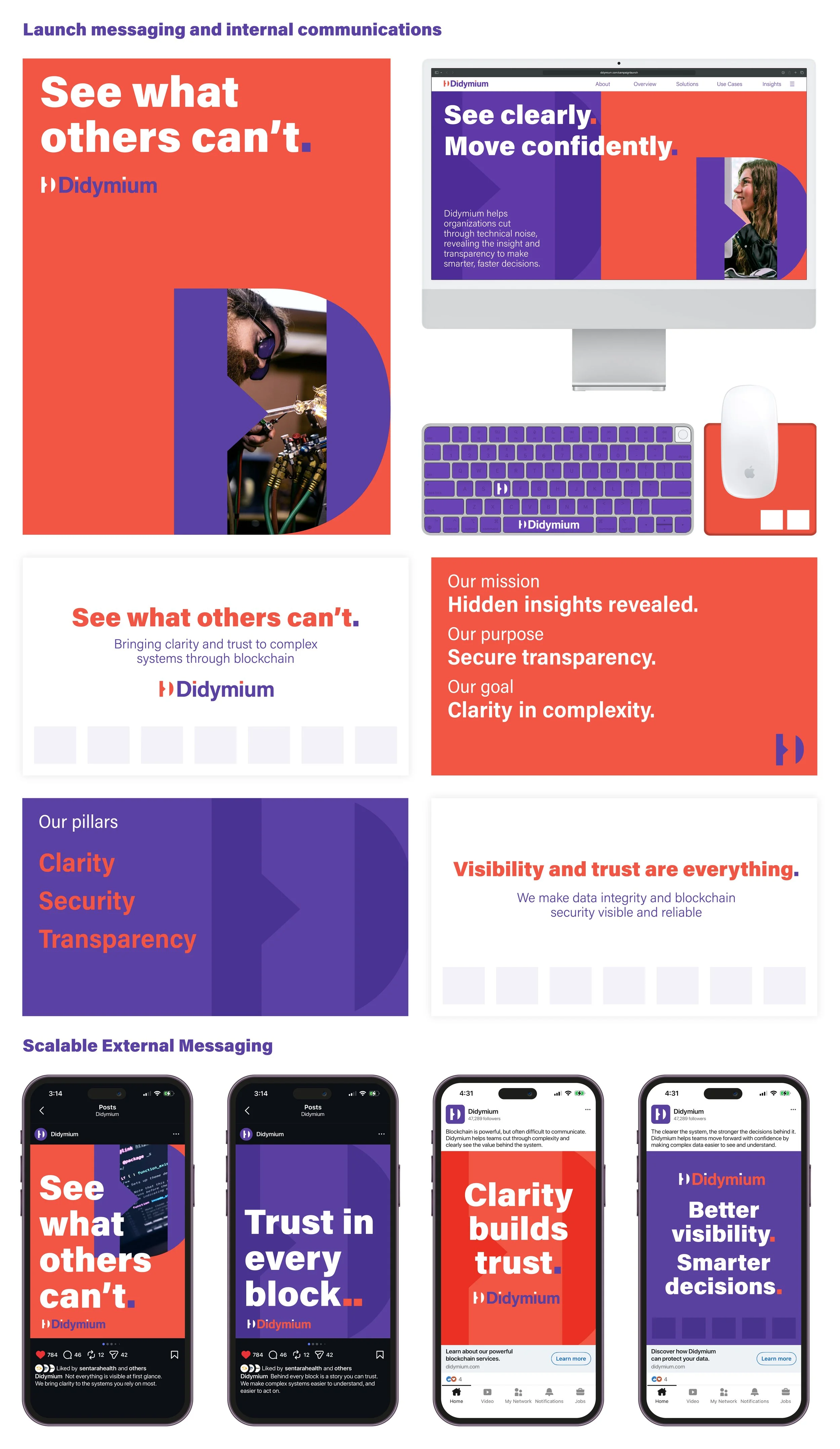
Didymium was an internal IT consortium of blockchain specialists within a local healthcare company. The challenge was making a highly technical space feel clear, relevant, and understandable for non-technical stakeholders.
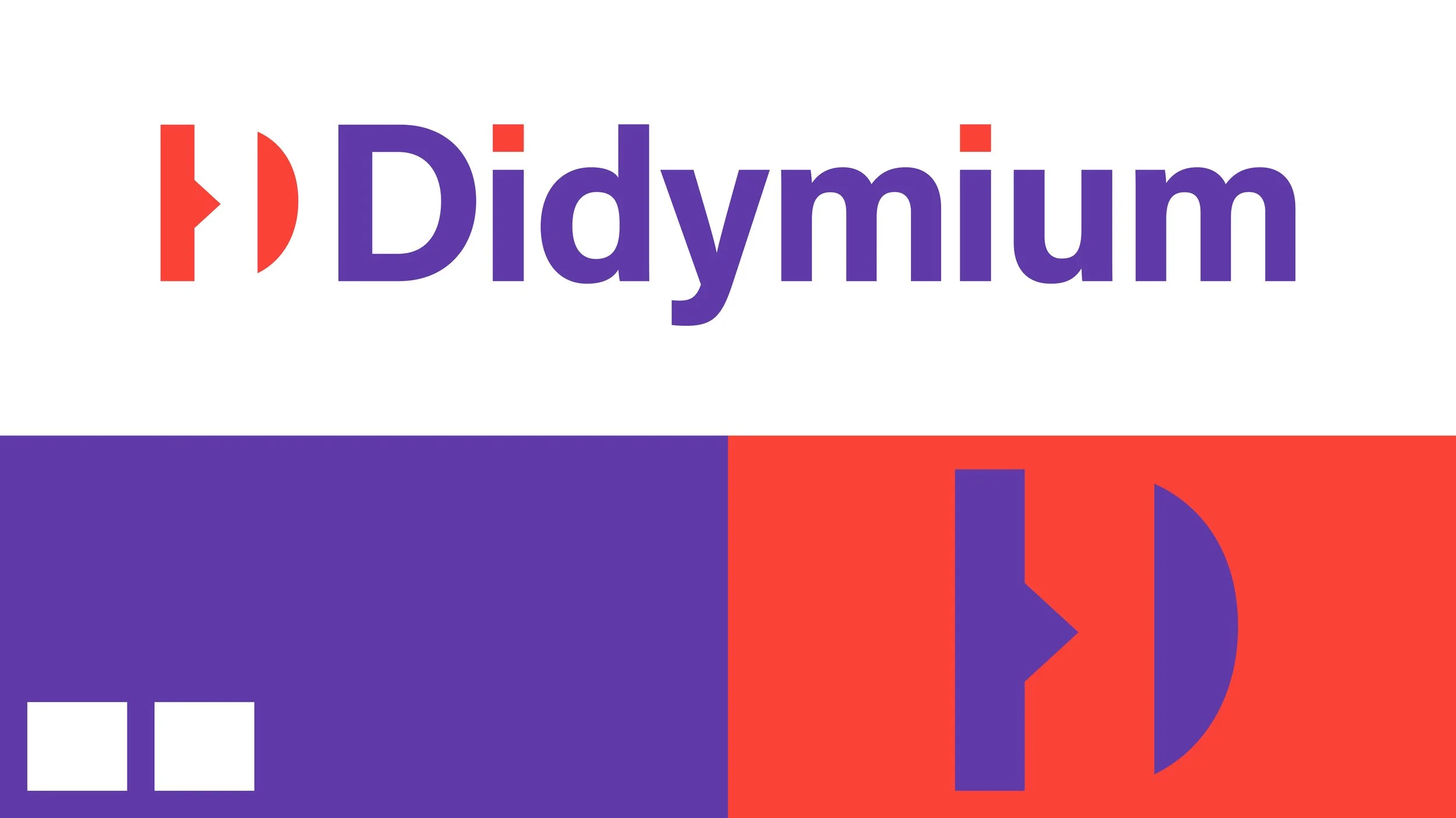
I led the brand development, building the concept around visibility and clarity. The name “Didymium”, a material used in glassblowing to filter light and improve vision, became a natural metaphor for how blockchain can cut through complexity and reveal trustworthy insights. Parallel to this are two blocks pulled from the name, representing the two elements which make up didymium.
That idea of duality carried through the identity, from the paired dots referencing blockchain nodes to the custom “D” icon suggesting both connected systems and protective lenses. The color palette reinforces this, with purple evoking clarity and precision, balanced by red for energy and momentum.
Although the consortium dissolved before full rollout, this project became an opportunity to explore how a strong conceptual foundation can scale into a broader system.
I developed the campaign platform, “See what others can’t,” positioning Didymium as a partner that helps teams better understand, trust, and act on complex systems. The result is a flexible brand and messaging system designed to bring alignment and clarity across IT teams.